
An Image is Worth... How Many Words?
- Alexander Lopez

- Mar 28, 2020
- 11 min read
Updated: Jan 4, 2021
Examining the (in)famous IKEA assembly instructions and their unusual lack of text.

[Photo Credit: Jim Davies on Flickr via Compfight cc]
I’ve heard plenty of horror stories about IKEA furniture: Couples torn apart by a misconstructed bookcase, children running in terror as their father slings curses at a half-built computer desk. Yet, others claim these manuals really aren't that confusing, asserting that this first group of people are big, dumb babies that can’t follow simple directions.
Personally, I’ve only constructed one thing from IKEA (the computer chair I’m currently sitting in), and the experience was exceedingly average. Not terribly hard, not delightfully easy.
Love ‘em or hate ‘em, IKEA manuals seem to get a whole lotta attention. That’s not terribly surprising, given that they’re one of the top-selling furniture stores in the US.
But something else distinguishes IKEA from other furniture retailers: IKEA assembly instructions rarely include text. Instead, their manuals rely almost entirely on images.
The main benefit of this process is localization. Words must be translated, but a picture of a funny-looking man holding a hammer is universal. Because IKEA operates globally, any text they include must be translated to 35+ languages. Minimizing the amount of text in their manuals allows them to minimize the effort spent localizing their documents.
There’s a catch, of course. As most technical writers have learned, some ideas are best conveyed through images, while others are more appropriate as text. Relying primarily on just one of these tools makes it much more difficult to produce comprehensible instructions.
If the text limitation wasn’t enough, IKEA manuals also generally avoid color. This technique is a bit more common (typically done to minimize printing costs). However, it once again limits your options when designing a manual.
How do IKEA manuals compensate for these limitations? When should they make exceptions and include text? To answer these questions, I read through IKEA manuals for a variety of products.
The first challenge comes from the product design itself. If a bookcase somehow has 50 unique parts and requires 8 different tools to construct, no amount of fancy images or writing will make it easy to build for the average Joe.
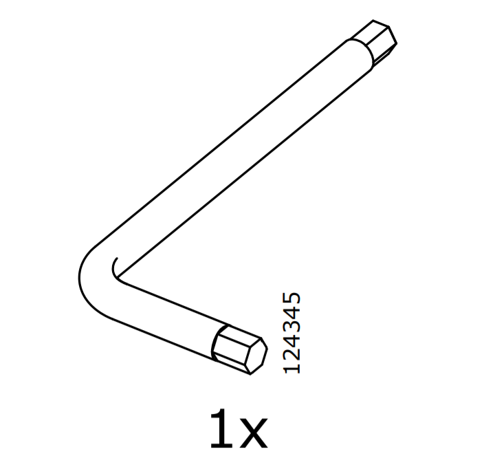
Consider MILLBERGET, a computer chair quite like my own. It has roughly 16 unique parts, including everything from the chair legs to the different lengths of screws. Not a super low number, but still manageable. Importantly, it only requires one tool to construct – this little L-shaped doohickey used to screw the screws:
Additionally, although there’s a decent amount of parts, these parts are connected very logically. Wheels connect to the chair legs, chair legs connect to a centerpiece, etc. Starting with a relatively simple and logical design makes the manual much easier to follow.
Overall, the assembly instructions for this chair are very easy to follow. For example, consider the steps on p. 11:

First, slide the seat onto the stand. Then, loosely screw the arms into the seat. Very clear directions without using any words.
This page demonstrates a few important tools IKEA uses to compensate for lack of text.
First, we see the same steps shown from different perspectives – zoomed-in and zoomed-out. This helps the user find both the larger parts they need to work with and the small, specific spots to manipulate.
The speech bubble icon is consistently used to indicate the zoomed-in perspective. This consistent usage helps the user easily understand what’s being depicted without relying on text captions.
In general, IKEA manuals make excellent, consistent use of symbols. Observe how IKEA consistently uses different types of arrows to denote different actions:

The straight, unidirectional arrows on this page indicate a sliding motion – slide the stand into the hole on the bottom of the seat. Throughout IKEA manuals, this type of arrow is consistently used to indicate a sliding motion.
Consider some more examples from this MILLBERGET manual:


In each case, straight arrows are consistently used to indicate a sliding motion.
Conversely, others types of arrows indicate other types of motion. For example, these arc-shaped arrows indicated to flip or rotate the part:


And these circular arrows indicate a screwing motion:


Finally, the chair usage instructions include bidirectional arrows indicating back-and-forth or up-and-down motion:

By consistently using different arrow types to indicate different types of motion, IKEA manuals avoid ambiguity without having to clarify steps via text.
For more examples of how IKEA uses symbols, let's look back at Step 7:

Here, they’re telling us to loosely screw in the arms – don’t tighten the screws all the way. The X over the tightened screw clearly indicates not to fully tighten it. The pointing hand further emphasizes the loosened screw.
When emphasizing an idea, it’s more common to use a straight arrow than a pointing hand. But IKEA manuals can’t do that – remember, their straight arrows indicate a sliding motion. Using hands for emphasis allow them to avoid any ambiguity with their arrow usage.
This step likewise demonstrates IKEA's effective use of numbers. In the zoomed-out view, we see 4 screws with lines indicating where to add them. In the zoomed-in view, a “4x” reminds us that we must indeed repeat this step 4 times. This 4x might seem unnecessary, but keep in mind that we can't always see all the screws from one perspective:

Here, the 8 screws we need to tighten can't be viewed from this one angle. Thus, the 8x is necessary in this step. Again, IKEA remains consistent throughout their manual by always including this multiplier with the zoomed-in perspective. They only omit the multiplier when a step in conducted just once.
Over and over, we see how IKEA's consistent use of symbols helps them avoid ambiguous instructions.
We've see how IKEA is successful with wordless documents, but when do the pictures fail? When does IKEA throw in the towel and add some text?
Let's look back at the first page of the MILLBERGET manual:

Unsurprisingly, the product and store names are expressed via text. Can’t really avoid that. The product names typically don’t need to be localized - most of them are Swedish proper nouns, so there really isn't much to translate. "IKEA" (an acronym likewise composed of proper nouns) also remains the same across languages.
However, I imagine “Design and Quality” and “…of Sweden” would either be localized or deleted. These phrases aren't terribly relevant to the assembly instructions, so I could understand if they just deleted them instead of localizing them.
While MILLBERGET certainly sounds odd in English, it’s still readable and pronounceable. Renaming it for English speakers is clearly unnecessary. However, I wondered if the same could be said for languages using other alphabets and writing systems. Do they really still call it a "MILLBERGET" in Japanese IKEAs?

Obviously, the only way to answer my question was to wander aimlessly through the Japanese IKEA website. I was flipping back and forth between the American and Japanese versions, trying to trace my steps back to this damn office chair, but then I realized I might as well at least try the search bar.

Well, shit. That was easy.
Clearly, they include the original Swedish product name even for languages as different as Japanese. "ミルベルゲット," the Japanese text right of MILLBERGET, translates directly back to MILLBERGET. So, they do localize product names for distinctly different languages, but they also include the original product name. Keeping the original name likely helps them consistently organize their products across a global market.
I'm still curious about the assembly instructions, though. Do they localize those as well? Between Google Translate and references to the English MILLBERGET page, it's easy to find the MILLBERGET assembly instructions on the Japanese site:

Oh.
They're exactly identical.
The entire "Japanese" manual is exactly identical to the English version.
The more I think about it, the less crazy it seems. Sure, they could include the localized product name here, but why bother? Nobody's gonna confuse their chair manual with their nightstand manual. And the text at the bottom right? Who cares! "Design and Quality" is a lame slogan anyway, Japanese people don't need to read it.
Having just one version of the manual for the entire world sounds pretty efficient. You only ever have to worry about editing and printing this one PDF. Granted, we live in a digital age where documents can easily be copied and modified, but still, it's less to keep track of. I can't say if this approach is better than just having 35 different translated PDFs, but I can see the benefits.
There are a couple other spots in this manual with non-localized text, but they're ultimately not too important:

I thought I was hot shit when I caught this. Wait a minute, IKEA, Japanese doesn't use question marks! They'll never understand your silly illustration! Yeah, well, it turns out other cultures commonly use question marks in animation, comics, etc. to denote confusion (even when question marks aren't part of the language). You win this round, IKEA illustrators.

I spent far too long thinking about this "CLICK!". If I only spoke Japanese, would I have any idea what "click" sounds like? Onomatopoeia is weird across languages - sometimes it's the same, other times it's completely different. Did you know Russian dogs says GAV GAV or TYAV TYAV instead of WOOF WOOF? Wild.
Given the drastically different writing systems, Japanese must have another term for "click." Google Translate spits out クリック (kurikku), and that translation sounds pretty accurate to someone who knows absolutely nothing about Japanese. Thus, this manual may be slightly more comprehensible if they localize "CLICK!" to "クリック."
Why bother though? The user will probably figure it out regardless. "Slide it in until it clicks" is a common theme in product assembly. Really, how could anyone mess this up? If the wheels are too loose, just push them in further. You don't need a "CLICK!" to figure that out.
Is "CLICK!" even necessary in the first place? It helps a little, but people who can't read it might feel like they're missing something important. Maybe they could've written the click differently to emphasize that it's a sound effect. Perhaps add a lil musical note, or some dramatic lines bordering the word?
I digress. "CLICK!" bothers me, but I'll admit it's utterly insignificant.
What's far more important are the couple sections of text that are localized. Interestingly, they're not localized in the usual way:


Here, we see a simple warning. "Do not try to replace or repair," referring to the stand connecting the chair legs to the seat. Then, we see this warning translated into 35 different languages.
When IKEA localizes text, they don't make 35 different versions of the manual for 35 different languages. They just include 35 different translations on the same universal document.
Once again, this allows IKEA to use just one PDF worldwide. Of course, it only works because there's so little text to translate. Seven words of English ends up taking a page-and-a-half of space after all the translations are done - imagine if they had to translate whole paragraphs.
This further clarifies why they didn't bother localizing any of the previous text: It would either force them to make manuals for separate languages, or they would use a ton of space including each translation. (I'd hate to be the guy who has to figure out 35 different ways to say "CLICK!").
That being said, why did they cave and include this text in the first place? Why not express it with pictures instead? My best guess is legal reasons. Imagine some doofus somehow breaks the chair stand and tries to replace it with the handle of an old tennis racket. This fails spectacularly, the chair collapses, and the dumbass busts a knee. Now, our foolish protagonist decides to sue IKEA for hurting his knee.
If this warning is expressed as pictures, then this dude can try to argue he didn't understand what the pictures meant. However, if the warning is clearly written in plain text, then there's really no room for argument. In terms of keeping people safe and avoiding lawsuits, it's best to be as clear as possible.
This is especially true of this specific warning, because it seems like it would be hard to express clearly with pictures alone. I can brainstorm some ways where you can sorta convey the idea of "Don't replace or repair," but there's just too much room for misinterpretation.
There's one other section of localized text in this manual, again related to safety:


Again, there's a potential safety hazard with the chair sliding or not sliding unexpectedly. They could've expressed this idea pretty clearly through images (see my mock-up below), but with anything safety related, you really want to remove any ambiguity.

The IKEA illustrators could easily produce a similar figure demonstrating the warning, but instead they chose to rely on text. Thus, it seems like IKEA manuals sometimes include text to be extra cautious, even if pictures would've adequately expressed the same idea.
Note that for this mock-up, I tried to adhere to the design principles previously laid out by IKEA. I reused many of their symbols, such as the weight, locks, and pointing hand. However, I did differ from one of the standards set by p. 15-16.

Here, they use dashed lines to indicate the motion of the chair. I had difficulty neatly replicating this method, so I instead indicated motion with a transparent outline of the chair and motion lines. In a final product, I would ensure complete consistency with other pages of the manual.
This analysis prompted me to look over a few more manuals. Sure, it’s fairly easy to avoid text for a safe, simple chair, but what about something more dangerous and complex? What about the BETRODD range with double oven and gas cooktop? A product with such a hazardous, complicated set-up must require way more text warnings and instructions.
Well, just check out the first couple pages of the assembly instructions:


No amount of fancy arrows or zoomed-in perspectives can handle all the warnings and steps in this bad boy. Skimming through the manual, there are thousands of words to read through - a huge departure from the MILLBERGET instructions.
With this many words, there's really no hope of including translations for 25 languages on the same PDF - the full manual would be almost 650 pages long! In this version, they can only squeeze in English and French translations, for a total of 37 pages.
I had hoped to find a localized Japanese version of the BETRODD instructions on the Japanese website. Unfortunately, Japanese IKEA doesn't list this product online. I browsed through other stoves, but none of them included assembly instructions on the Japanese website.
Could this reflect a weakness in IKEA's localization infrastructure? The U.S. IKEA website consistently includes assembly PDFs for any relevant products, but it feels like the Japanese website struggles to meet that standard.
I searched around for other complicated products, hoping to find assembly instructions localized to Japanese. However, it seems like the vast majority of IKEA manuals manage to mostly avoid text. The only place I could find evidence of a localized Japanese manual was this complicated TV stand. Here, there's a very small difference between the English and Japanese assembly PDFs.
As seen in other examples, the English manual includes a text warning that's translated to 35 languages:


Amusingly, these pages demonstrate that some countries require much more dramatic labels.
However, the Japanese instructions have just 1 warning page instead of 4.

Something kind of odd is happening here. In the Japanese PDF, they only included the page of translations that had Japanese on it (p. 5 of the English PDF). However, they also copied the English translation over to the top of this page.
It's a perplexing decision. The English manual already has all the translations, including Japanese - why not use the same PDF for every region like they did with the MILLBERGET manual? Why bother removing some translations from this PDF? Sure, it makes the manual smaller, but they don't use this approach for their other manuals.
It's a strange inconsistency from a company that has otherwise proven very consistent across regions.
Perhaps there was some shift in policy down the line. Maybe someone at Japanese IKEA noticed this manual was fairly long and decided to cut down on printing costs by cutting a few pages. The decision to alter the PDF seems justifiable, it's just the sudden inconsistency that bothers me.
More importantly, this weird example is all I could find in terms of localized Japanese instructions. I couldn't find anything with thousands of words of Japanese text like the English/French BETRODD manual. If IKEA does have more localized instruction manuals somewhere, they're much harder to find than the English versions.
Don't get me wrong - IKEA is definitely correct to rely more on text for their more complex and dangerous appliance manuals. When there are significant safety concerns, you have to be as clear as possible. But, it feels like they struggle when it comes to localizing these lengthy text documents. Perhaps their efforts to only use images and minimize localization have left them unprepared to deal with these long, text-based manuals.
That being said, I am again very impressed at how IKEA manuals circumvent their limitations. Their consistent, logical use of symbols allows them to very clearly explain steps without relying on any text. Yet, they also acknowledge when their images just don’t cut it and add text accordingly.
I'm not really sure if IKEA's approach to localization is the best way to handle it. They go through so much effort making these single documents that can be understood globally, but I don't see many other companies trying to mimic their approach. It seems like most other companies prefer to make a few dozen different localized documents instead of having some fancy universal PDF.
Regardless of which approach is best, I can say that IKEA does an excellent job of producing manuals under these limitations.
Takeaway: IKEA demonstrates how powerful a well-constructed image can be. If you're working with images, try to image how you would use those images if you couldn’t use text or color. You don’t actually have to restrict yourself; just imagining these limitations will help you construct more comprehensible images. Specifically, IKEA demonstrates that it's crucial to use symbols and images consistently.


Comments